ADIDAS
SHOE CATALOG
Publication
Softwares Used: Adobe Illustrator, Adobe Photoshop, & Adobe InDesign
For this catalog, I wanted to highlight some of Adidas’ biggest shoes of 2020. The goal was to stay true to the brand while bringing in as much energy to the project as possible. This was achieved through experimental type treatments and photography. Before I started designing for the client, I decided to research some of their previous works.
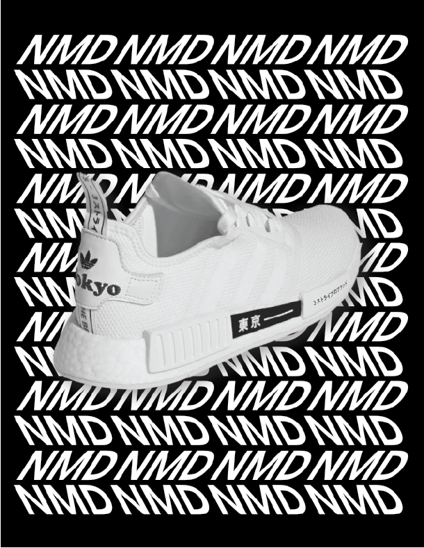
This research included studying previous ads and understanding their brand style guide. From the research I realized, this brand used a lot of typography to get their point across. So, for my execution, I found ways to make type and image work in unison. This publication went on to receive an honorable mention at the 2020 International Design Awards.

OBJECTIVE
When faced with choosing a brand to create a catalog for, I decided to choose Adidas as my client. This company is known for its sleek and innovative design so taking on the task would require an ample amount of negative space and a bold but simple color palette. For their advertisements and other promotional materials, I noticed Adidas doesn’t use their primary typeface in a bold typographic way. This was my chance to bring this vision to life!
COVER
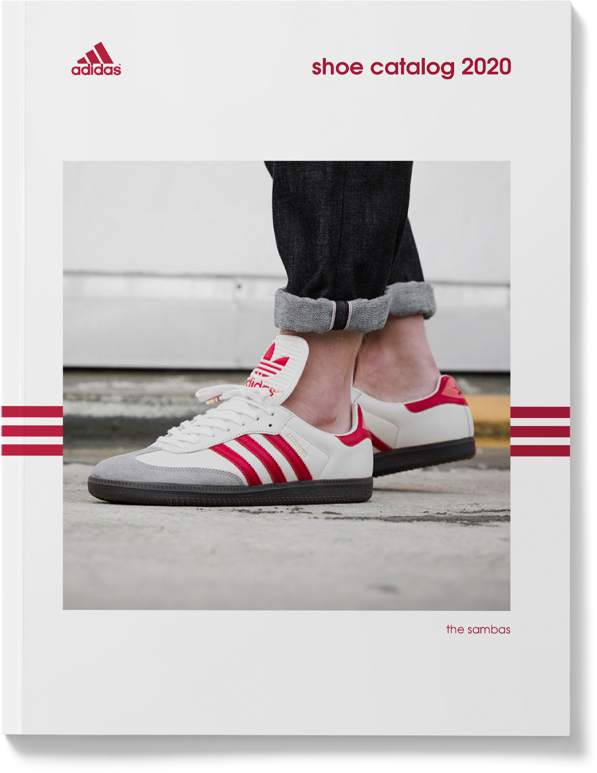
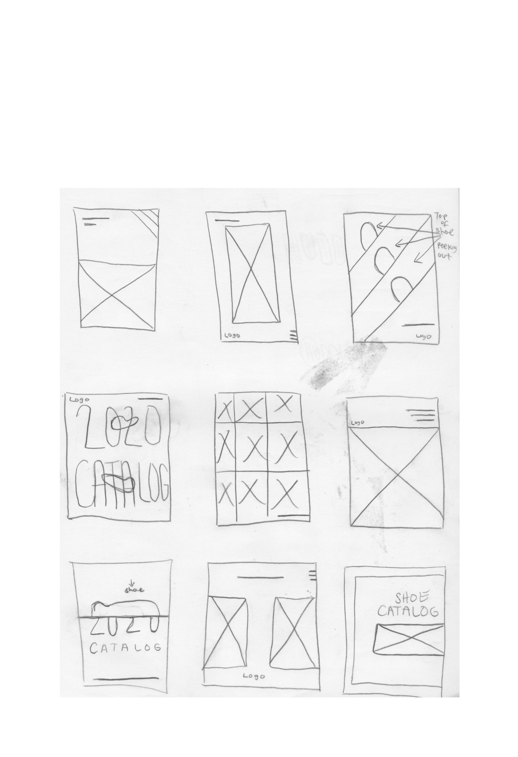
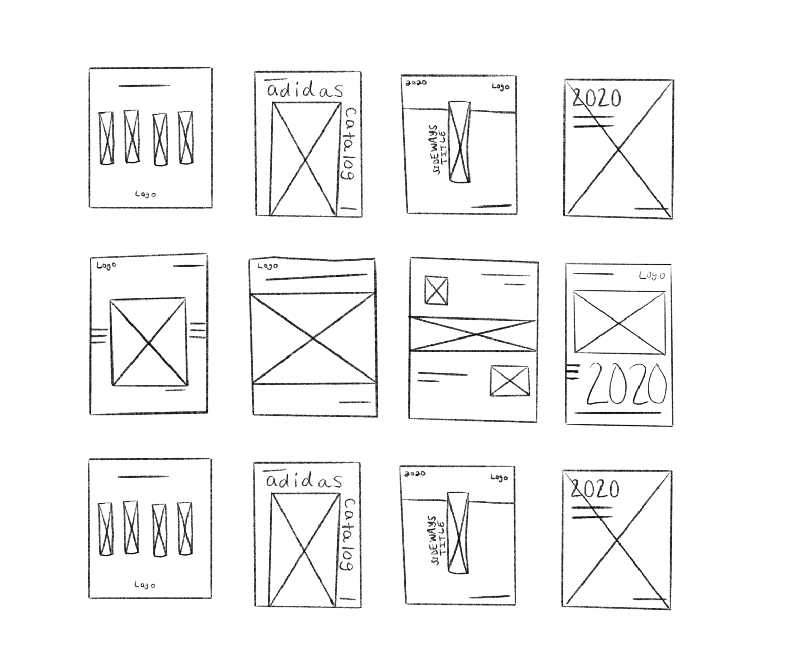
For the cover, I knew I wanted the shoes to be the main focal point of the composition. For this reason, I used the iconic 3 stripes to lead the eyes directly to the shoes. Negative space was used to help the viewer focus primarily on the shoe while also allowing the eye to relax. The colors used for the cover imitated the color of the 5 hero spread shoes. With every cover iteration, I kept the thought of promoting a fan favorite shoe while staying true to the brands’ core design tactics.
HEROES
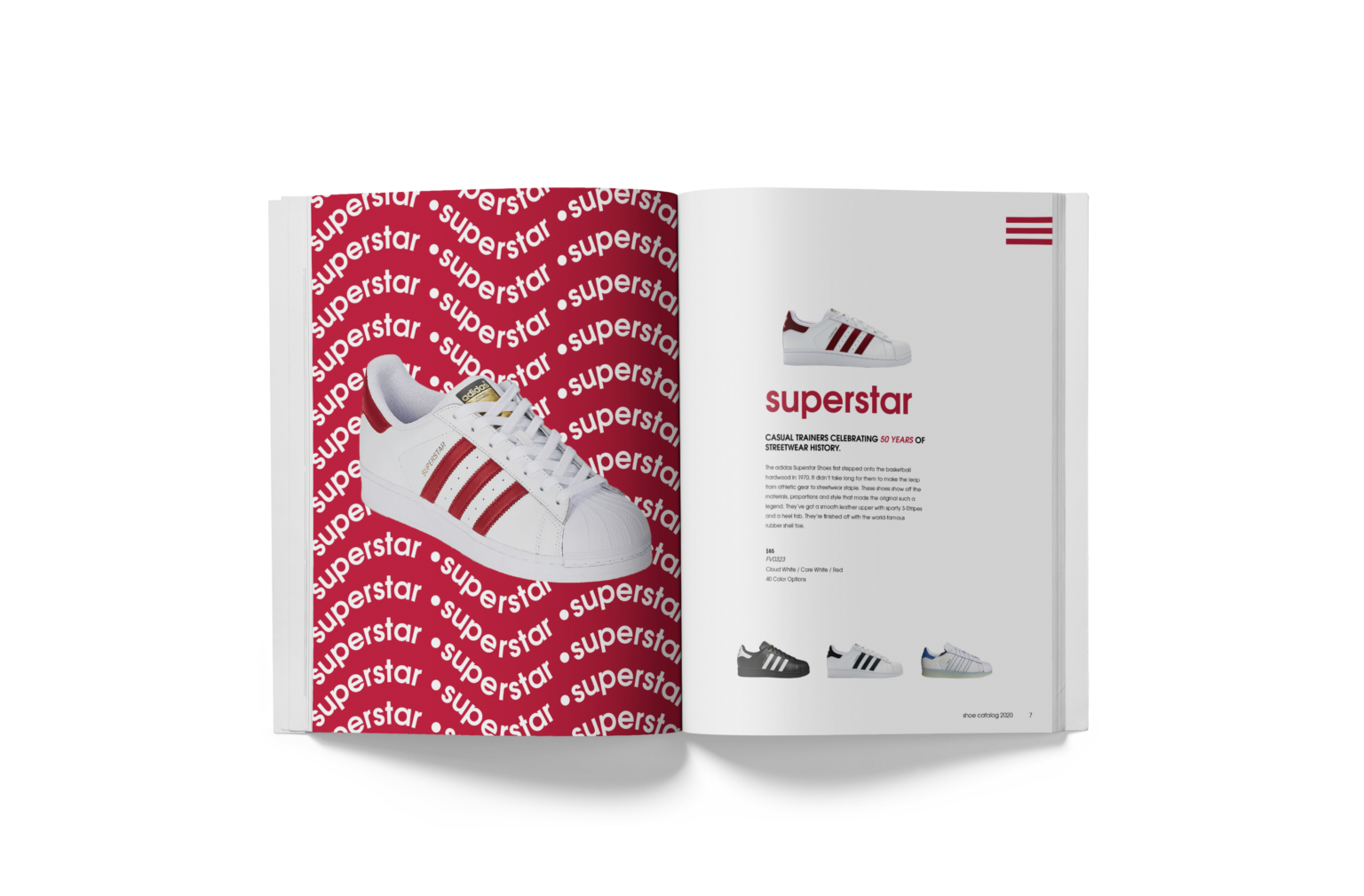
For the cover, I knew I wanted the shoes to be the main focal point of the composition. For this reason, I used the iconic 3 stripes to lead the eyes directly to the shoes. Negative space was used to help the viewer focus primarily on the shoe while also allowing the eye to relax. The colors used for the cover imitated the color of the 5 hero spread shoes. With every cover iteration, I kept the thought of promoting a fan favorite shoe while staying true to the brands’ core design tactics.
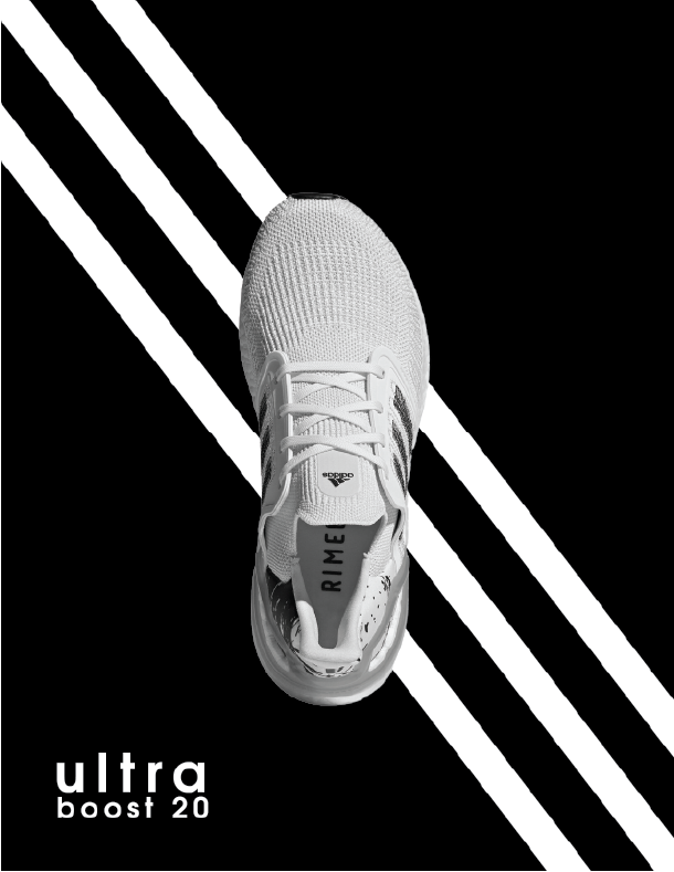 Version 1
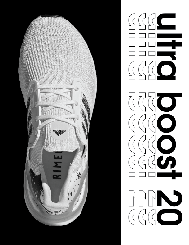 Final Version
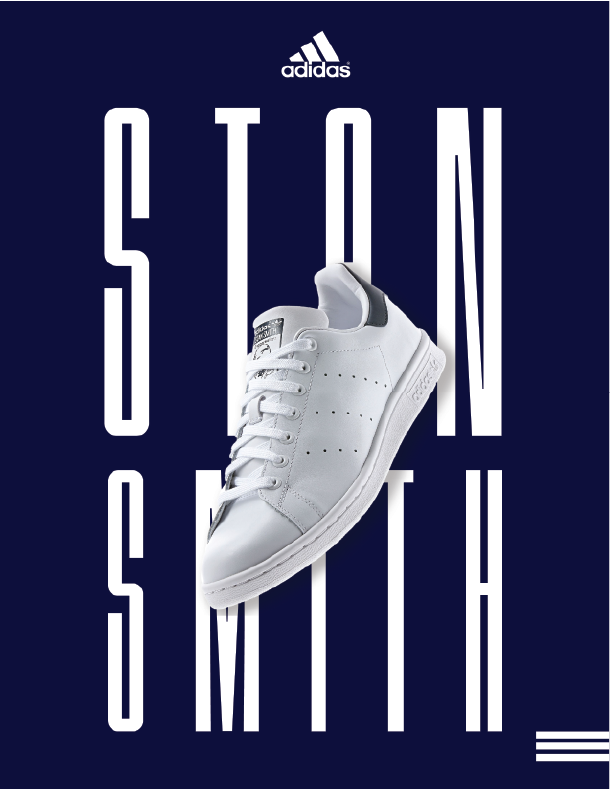 Version 1
 Final Version
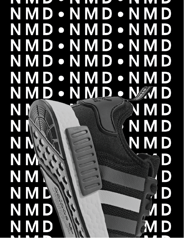 Version 1
 Final Version
THE OTHERS
These pages were used to showcase the other products in the catalog. Each page was structured and gridded like a traditional catalog to allow the viewer to scan over all the products with ease. Lifestyle photography shows off the Adidas wear in a fashionable way the consumer can relate to and visualize themselves in. When sketching these pages, I wanted to figure out the easiest way to push all of the shoes while still maintaining this flow of content on the left or right with a big photo alternating from left to right as well.
The size chart and terms of conditions allowed me to get a taste of how corporate design would feel in the real world. These are very realistic designs that consumers can benefit from, so it was essential to figure out a way to make it easily digestible for them.
