HUDDLE MAGAZINE
Publication
Softwares Used: Adobe Illustrator, Adobe Photoshop, & Adobe InDesign
Huddle is an award-winning fictional magazine brand that strives to break the mold of other sports publications. Unlike other sports publications Huddle primarily focuses on major events that take place in the football world. The reason I chose to take this approach was because growing up I was a heavy football fan but didn’t really focus on other sports until later on in my life. So much information could’ve been gained from a single sport magazine and so I decided to make this dream a reality.
Tying that back into this publication, my aim was to focus on one sport as a whole (football). This was achieved by highlighting upcoming major events, news about players, and provide information on the ongoing season. The magazine uses bold photography, an interesting use of illustrative elements, and bold typography to tie the whole publication together.

LOGO
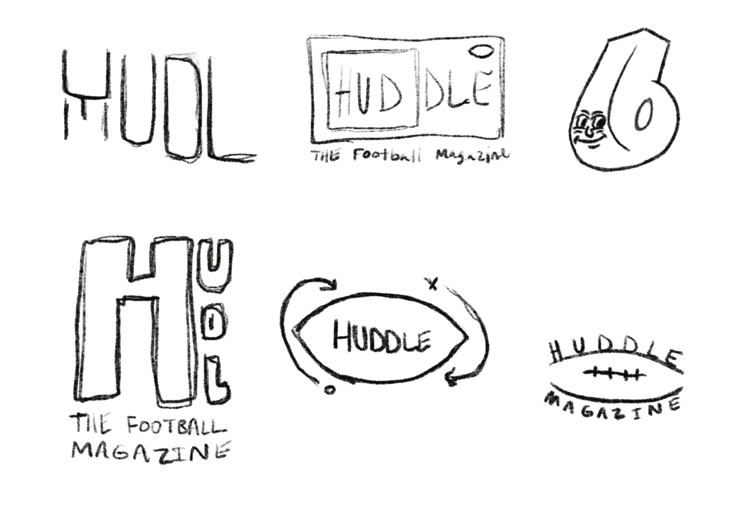
When designing the Huddle logo, I knew that I wanted it to go with a typographic heavy execution. Whatever type that was used had to be custom, feel sports like, but also feel related to football. The primary reason for this was because I wanted the logo colors to change every month with a new corresponding team.

COVER
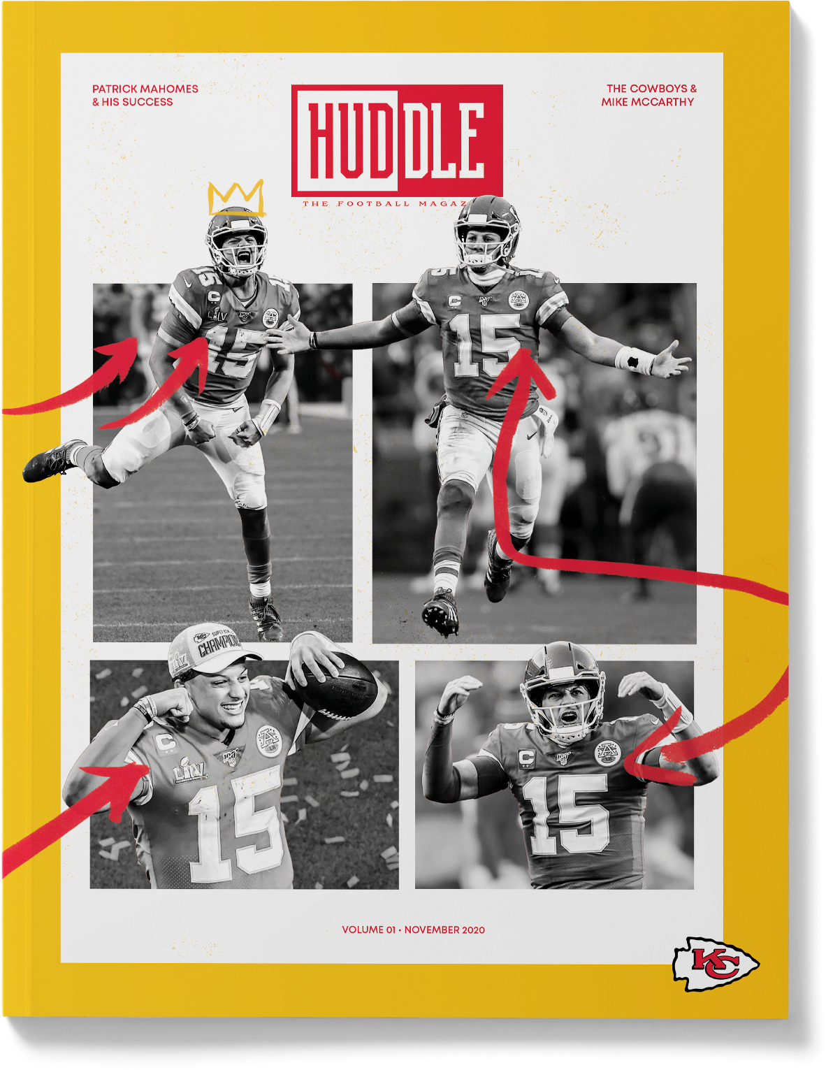
Each sketch focuses on a different approach I wanted to tackle for the cover. I knew I wanted a specific player to be on the cover each month and for their team colors to change every month with each new publication. With every sketch, I experiment with playful typography and layering to get this sense of depth. When approaching the cover, I knew a gridded-out execution could help with elements, but the real challenge was making grid photos look cool and interesting. That’s when I landed on bringing the subject out of the boxes but also contained at the same time. This fulfilled the need for depth and in an interesting way that the consumer can appreciate.
INTERIOR
Each interior page tells a story from the intro spread down to the last page. When making these spreads I stepped out of my designer mindset and really thought about it from a football fans’ point of view. From easily digestible infographics to ads that appealed to the target demographic, everything was planned accordingly. In these features, I show my Photoshop skills, typography skills, and most importantly the skill to tell a story through design elements.


